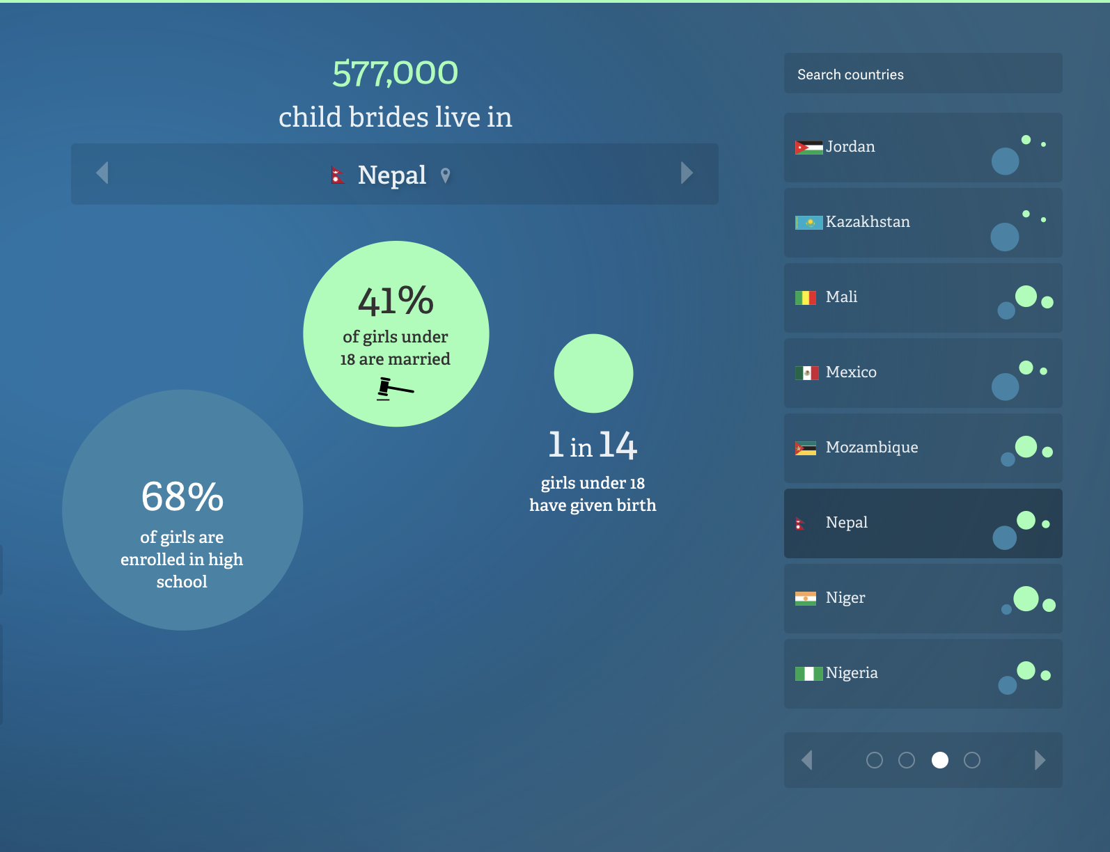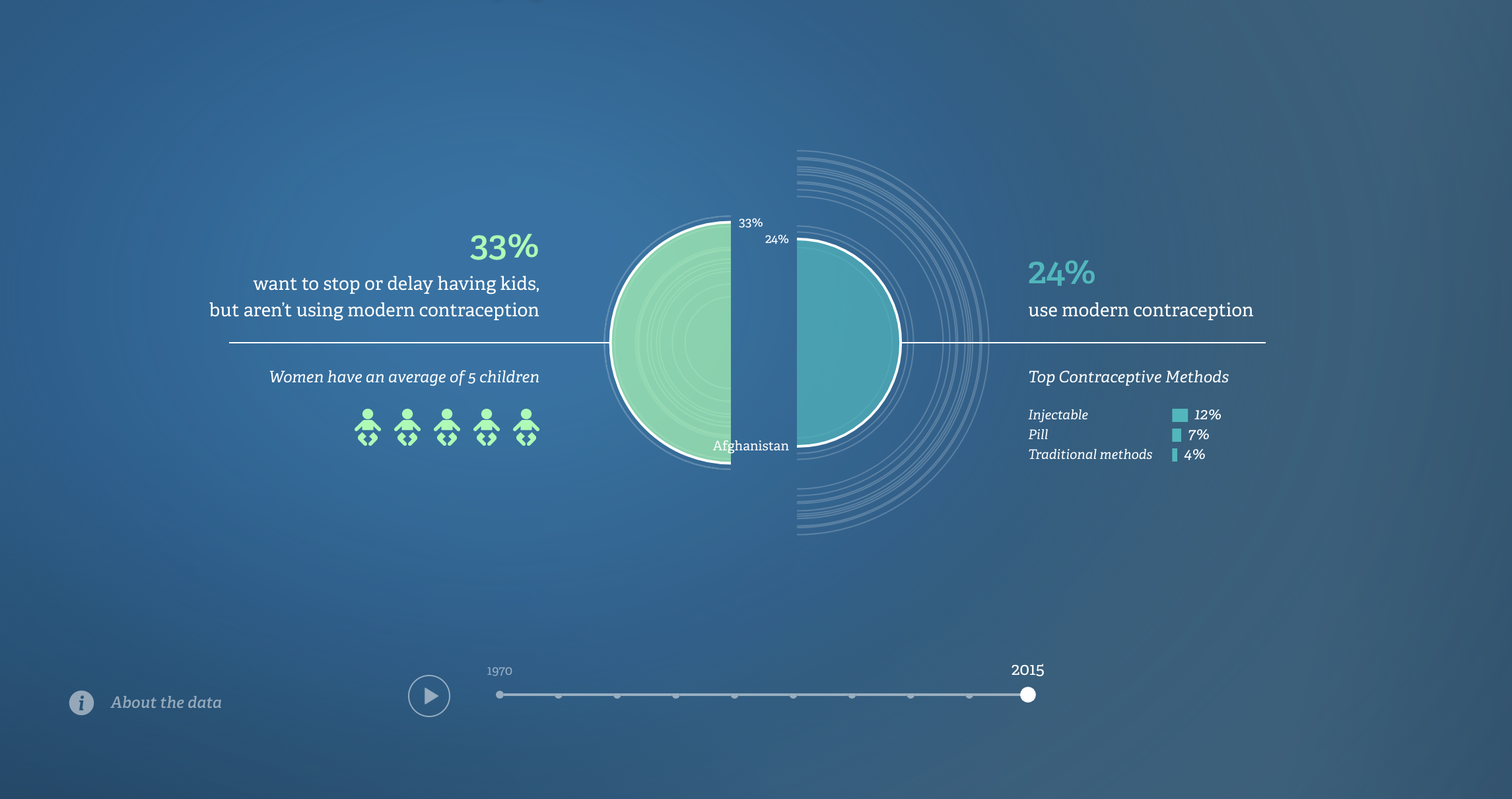
This data shows a comparison between the number of women who have used modern contraceptives verses the number of women who aren’t using contraception in various countries (Ghana, Uganda, Turkey, Spain, US, China, etc.) The slider at the bottom of the page shows the changes in the data from 1970 to 2015. TEach country has different averages of children and uses of contraceptive methods. As the years increase, more women are using modern contraceptives. The motion and interactivity of the data, allows the user to navigate and compare the results in different countries. The author may visualized the data in this way to show the increase of conceptive usage over time and highlight how family planning has not been met since 1995.The data comes from the United Nations, Department of Economic and Social Affairs, which seems to be a reliable source.