WEEKLY : 4
Ugly VS Pretty
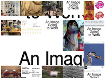
I consider this poster to be "ugly" because it intentionally uses a collection of unedited and random photographs as well as a default font. Its arrangement goes against the conventional clean aesthetic of graphic design that is most commonly appreciated by the public. The overall outlook mimics amateur graphic design and embraces the reversal of purity and symmetry.
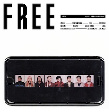
Whereas, this Instgram post for the band Hyukoh is considered “pretty”. The arrangement of the text and photograph follows the clean and minimal aesthetic of graphic design that is most dominantly used.