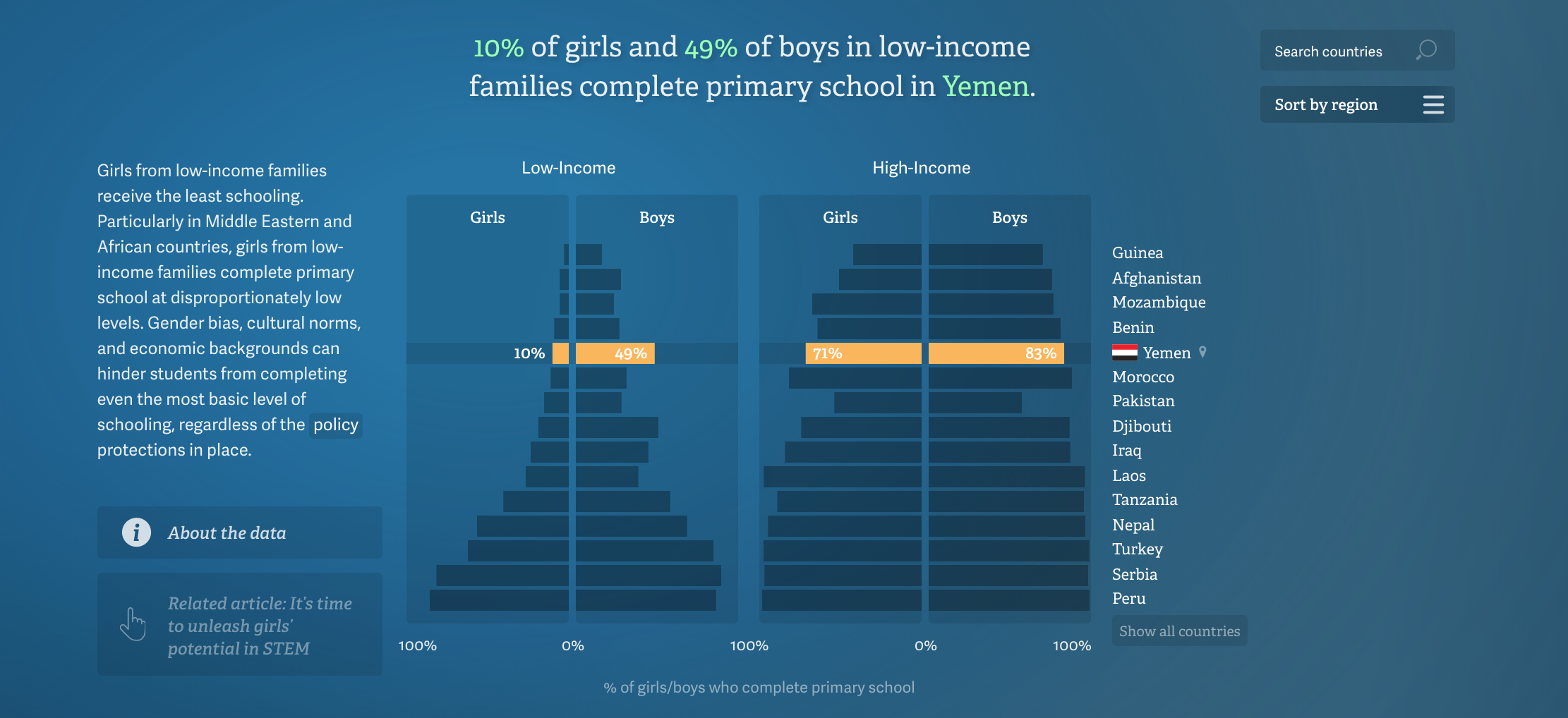
Girls from low-income families receive the least schooling
This data was visualization was the most clear to me at first glance. All the information were organized in a row column system of each row showing the information about each country. I still don’t understand if the colors represent anything but it was a great way to differentiate each bar/country. The information was organized in a way that the difference of the girls in high income vs low income was so drastic in certain countries.
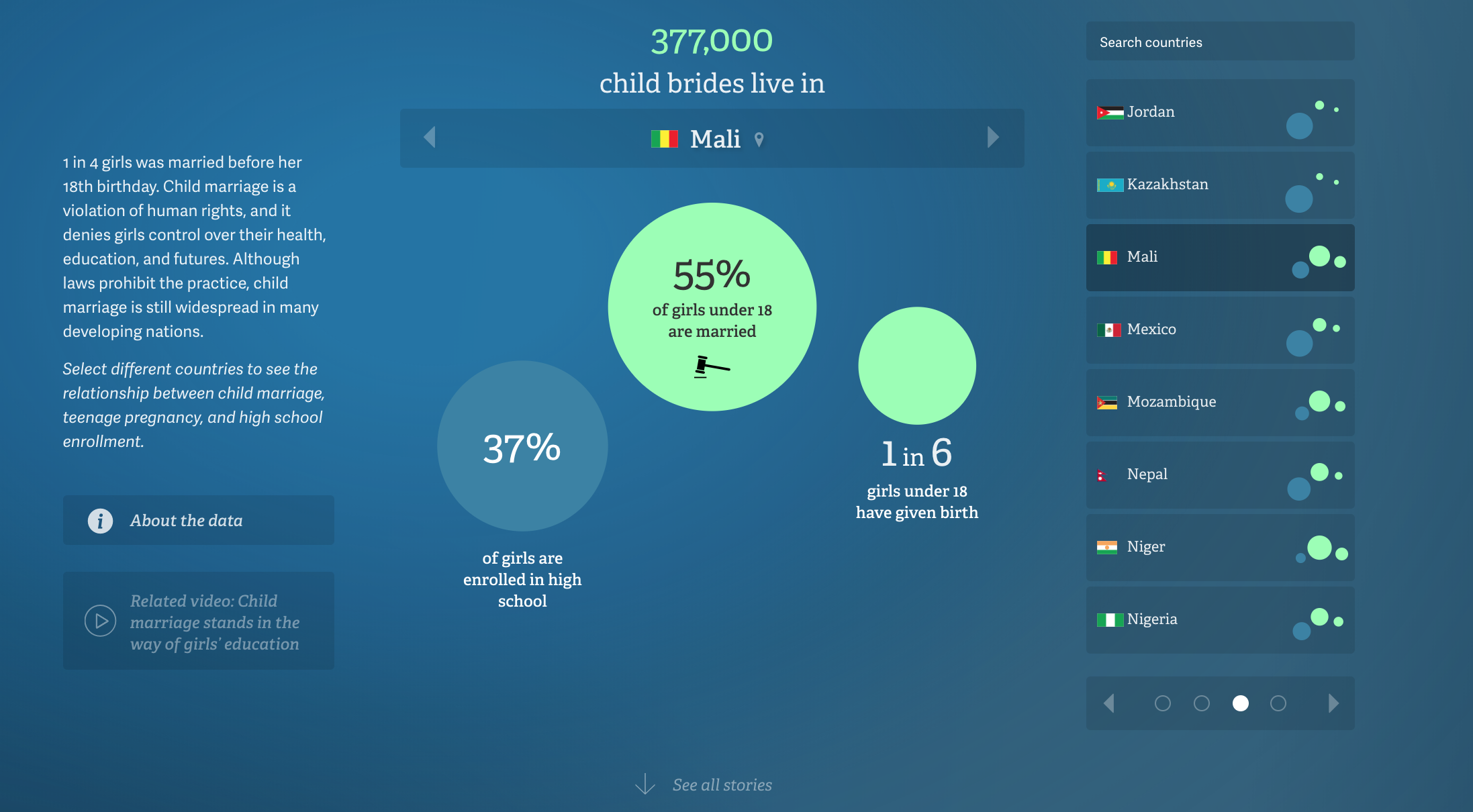
1 in 4 girls was married before her 18th birthday
I didn’t really understand this visualization at first, and was confused at why they had the percentage of the girls enrolled in high school, but as I clicked through the data for different countries, I realized that some countries, the circle for the girls enrolled in high school was way smaller than the girls who marry under the age of 18. I was able to distinguish the relationship between the three different information without reading.