German
Design School Bauhaus 1919-33
The
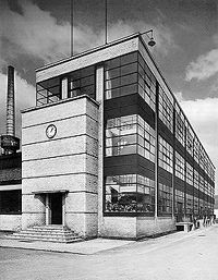
Bauhaus began with an utopian definition: "The building of the future"
was to combine all the arts in ideal unity. This was intended to remove
any distinction between fine arts and applied arts.
The reality of technical civilisation, however, led to requirements that
could not only be fulfilled by a revalorisation of handcraft. In 1923,
the Bauhaus reacted with a changed program, which was to mark its future
image under the motto: "art and technology - a new unity". Industrial
potentials were to be applied to satisfactory design standards, regarding
both functional and aesthetic aspects.
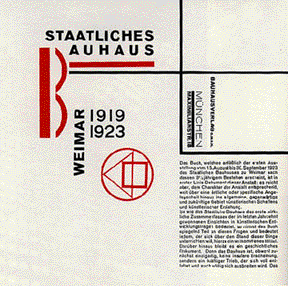
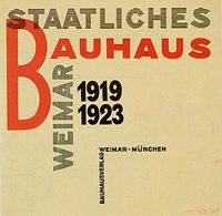
László
Moholy-Nagy, Title page of: "Staatliches Bauhaus Weimar 1919-1923",
1923
In
1923, after joining the school, Moholy-Nagy introduced the ideas of "New
Typography" to the Bauhaus. He considered typescript to be primarily
a communications medium, and was concerned with the "clarity of the
message in its most emphatic form".
The Bauhaus' typography was closely connected to corporate identity and
to the development of an unmistakable image for the school. Characteristic
for the design were clear, unadorned type prints, the articulation and
accentuation of pages through distinct symbols or typographic elements
highlighted in color.
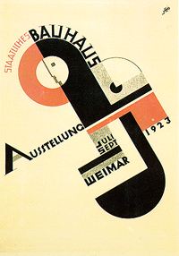
Joost
Schmidt
Poster for the Bauhaus exhibition in Weimar
1923
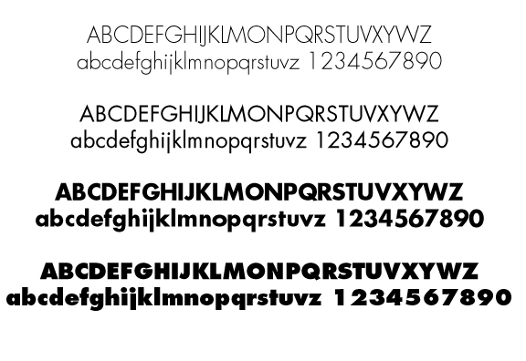
Herbert
Bayer "Universal Alphabet"
1925
Moholy-Nagy
Cover for Bauhaus
Herbert
Bayer.
Exhibition Poster
1928
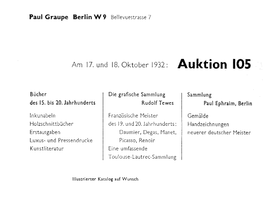
Jan
Tschichold
Auction advertisement, 1932
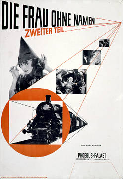
Jan
Tschichold
'The woman without a name, part two"
Poster.
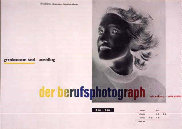
Jan
Tschichold.
"Der Berufsphotograph." Color offset poster
1938.
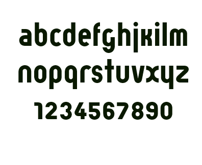
Paul
Renner
Futura Typeface
1927
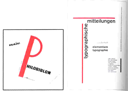
Jan Tschichold.
"Elementare typographie"
Cover and insert
1938
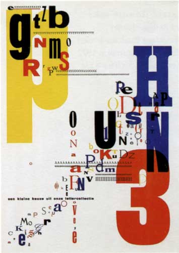
Piert
Zwart
Drukkerij Trio
(Trio printers)
Page from booklet, Netherlands, 1931
Letterpress
In this masterpiece of experimental typography Piet Zwart mixed sizes
and styles of type and printed the elements in successive layers of color.
Although the letters appear to glide freely through space, creating depth
by appearing to shift forward and backward, each character reflects the
upright orientation favored by the system of letterpress printing
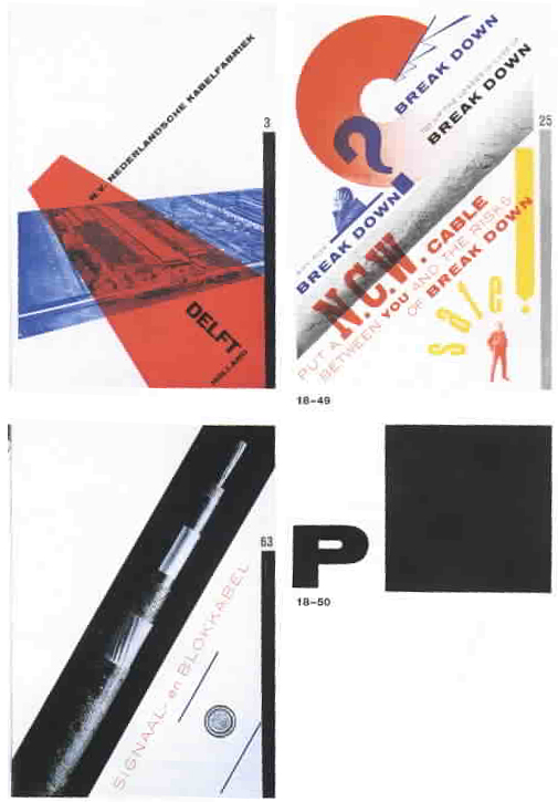
Piet
Zwart,
pages from the NKF cableworks catalogue, 1928
Eric
Gill
Gill Sans Typeface
1928
Stanley
Morison
Times New Roman Typeface
1932