Portfolio-------------------> L.Andy Ajonjoli
-
------------------->
-
------------------->CONTACT.
2015- Berlin ajonjoli@ucla.edu -
------------------->STATEMENT
I process research and design/art much like food. I approach the item, usually quite critically, and from a distance. I observe its appearance and the way it interacts with its environment (usually dependent on color and form). This helps me understand the general context in which I should approach the item of research. I get closer. At this point I begin to smell and to feel. Here, I am able to visit a space relevant to the item of research and gain a more tactile approach, which can be helpful in generating a different way of describing what I am searching for. Lastly, I savor every element of the item and I draw connections and point out complimentary contrasts- what works what doesn’t work what’s useful. It is from this final stage of the research that I am able to introduce my findings and work with them. ---> I digest -
------------------->
-
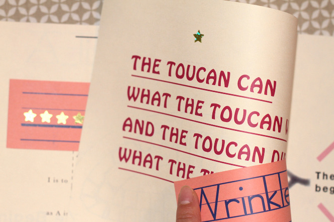
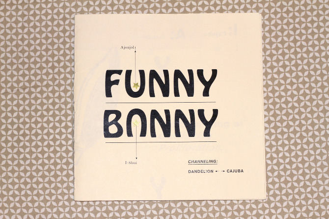
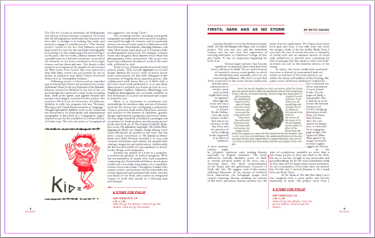
FUNNY BUNNY
A collaborative project with designer Michelle Lin. Conceived and Produced within 2 days. We met that summer. Edition size: 10. All writing and visual content created collaboratively.
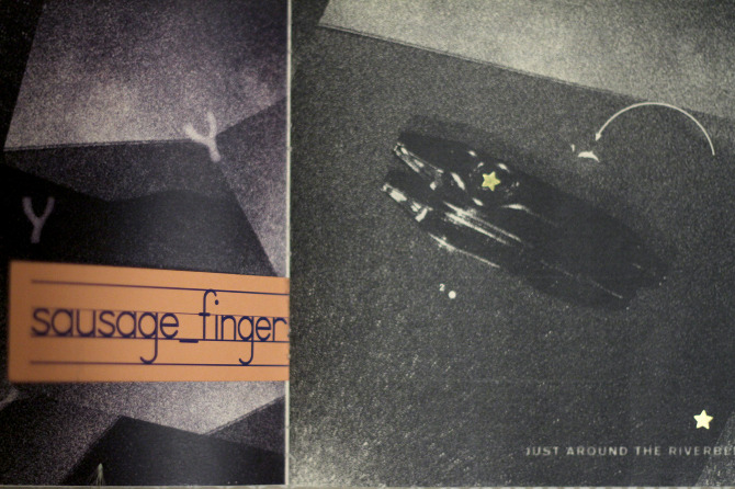
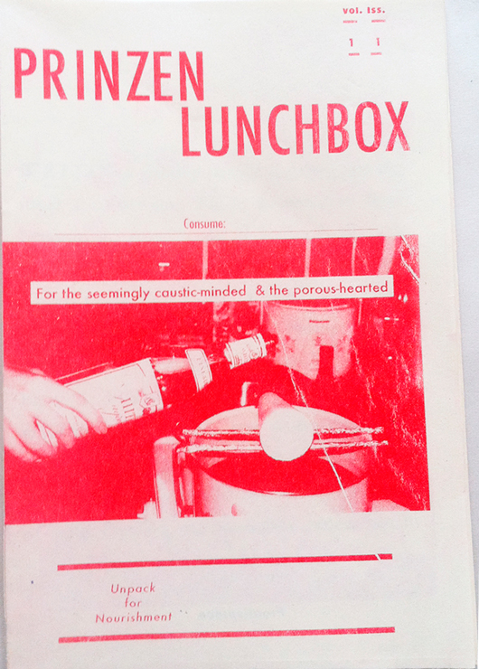
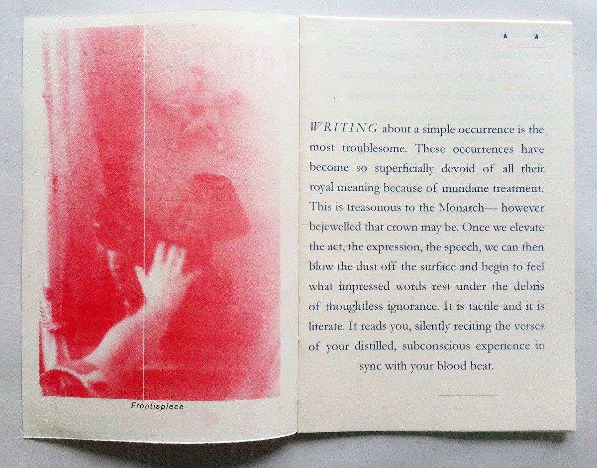
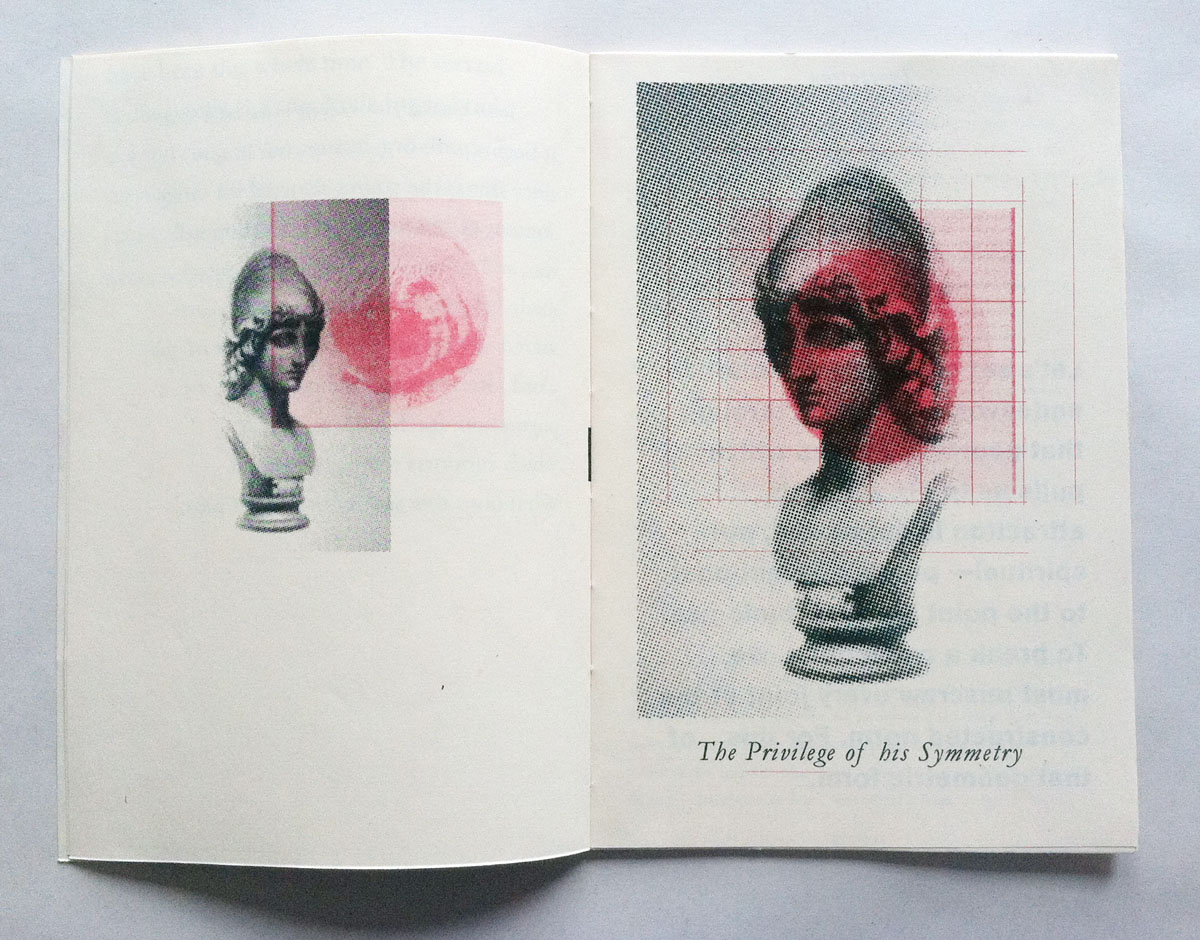
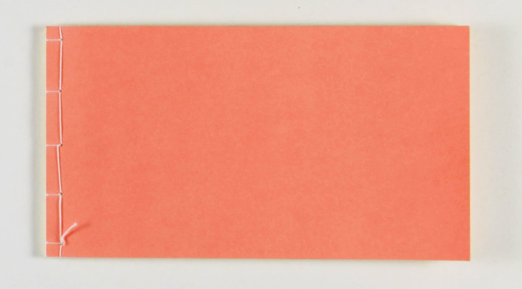
PRINZEN LUNCHBOX
Artist Publication. Printed on Risograph by Gabe Gonzales in California. Limited edition of 50. Prinzen Lunchbox was conceived out of an urge to self-publish and exercise control over all curatorial/ editorial/ creative direction. I wrote/designed the whole thing.
UX
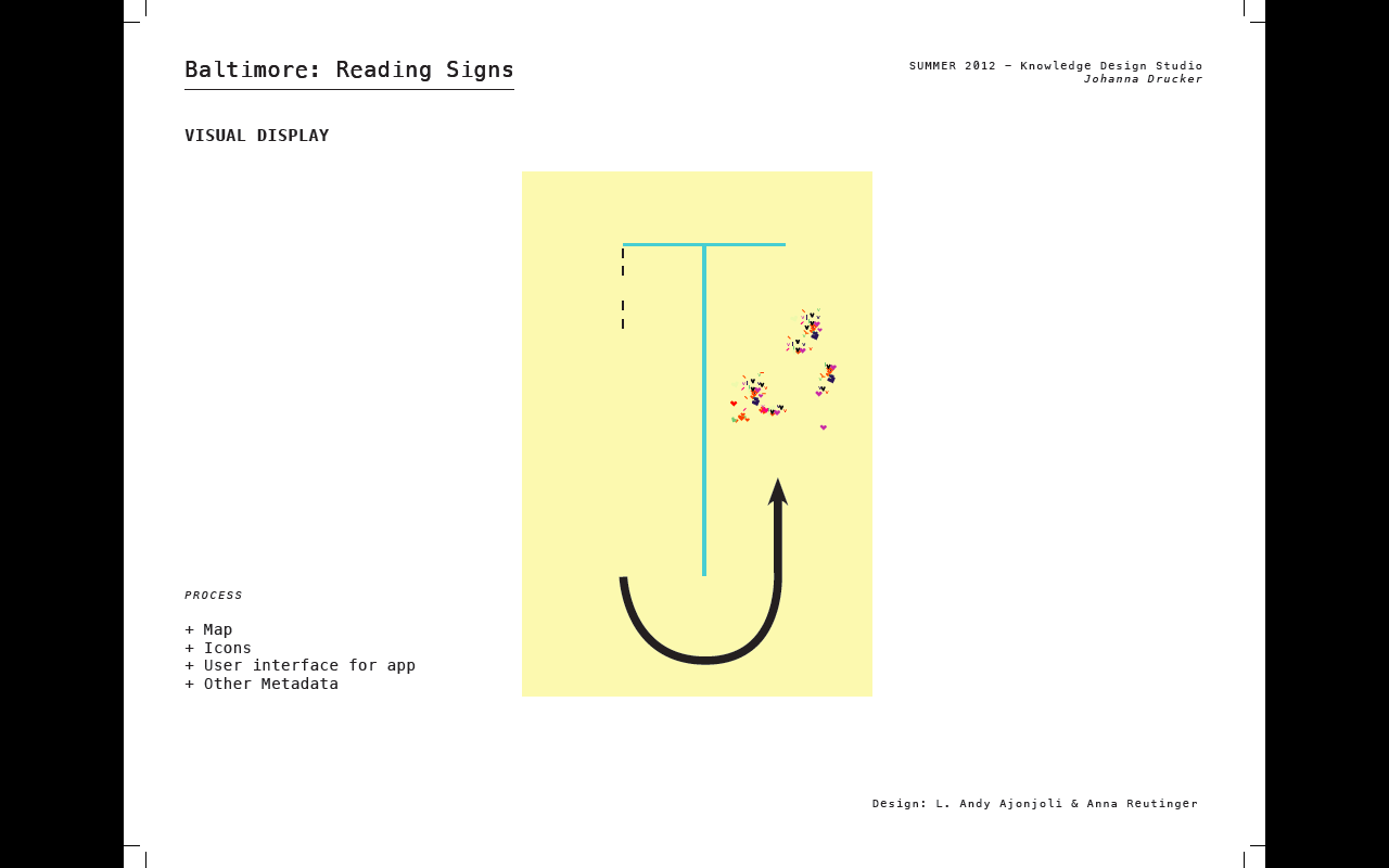
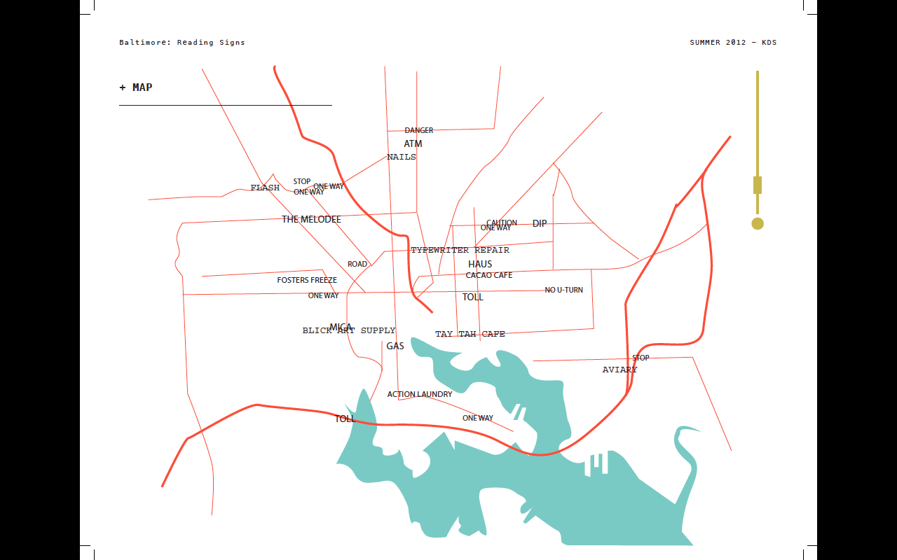
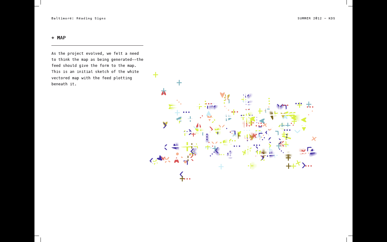
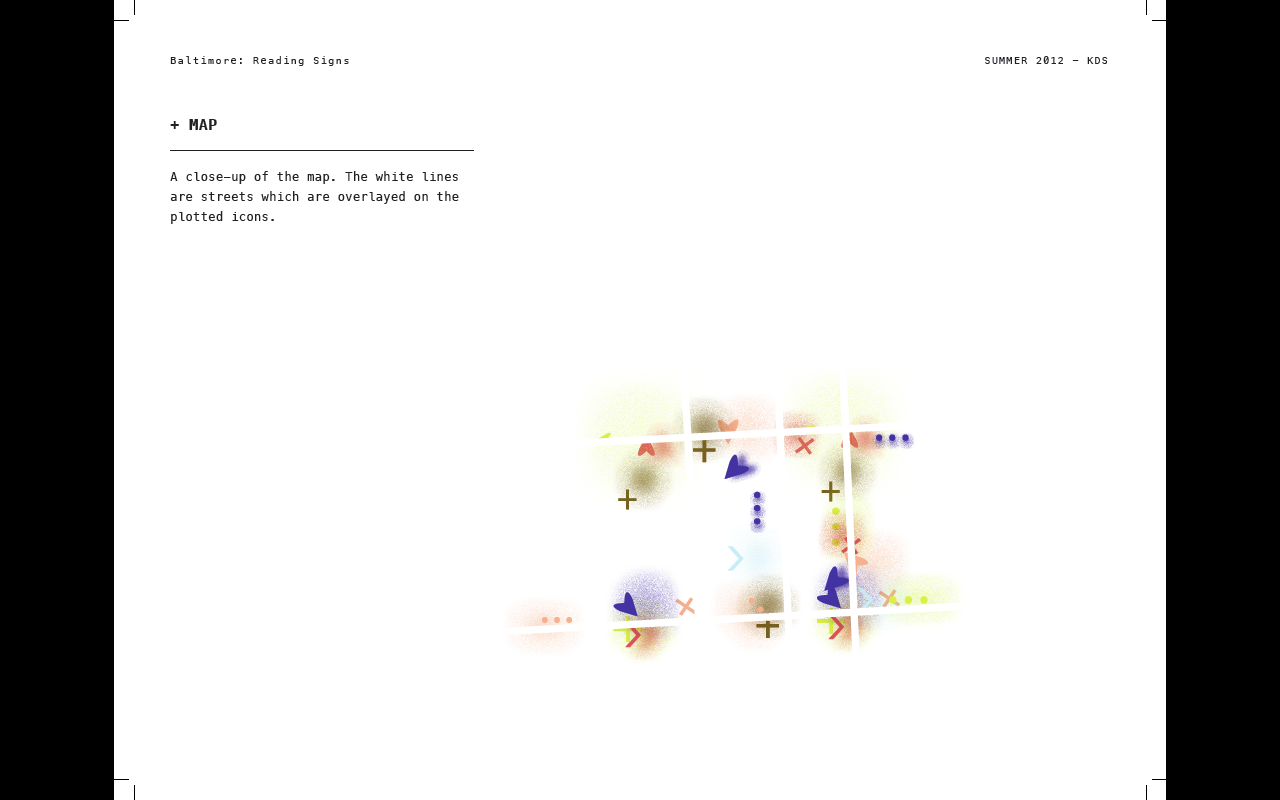
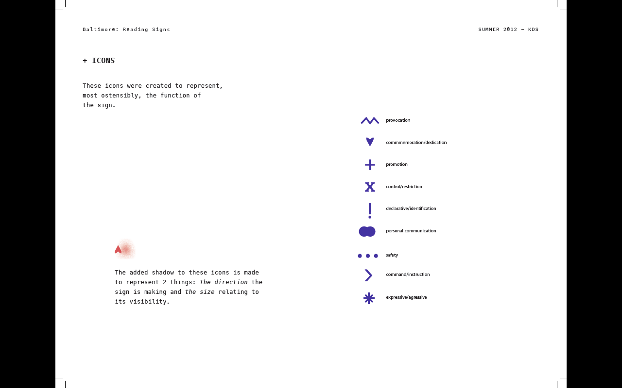
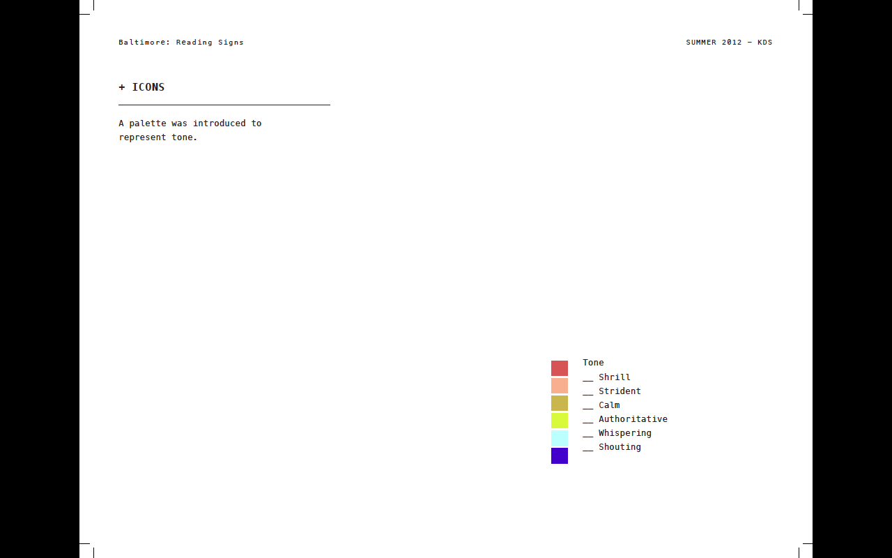
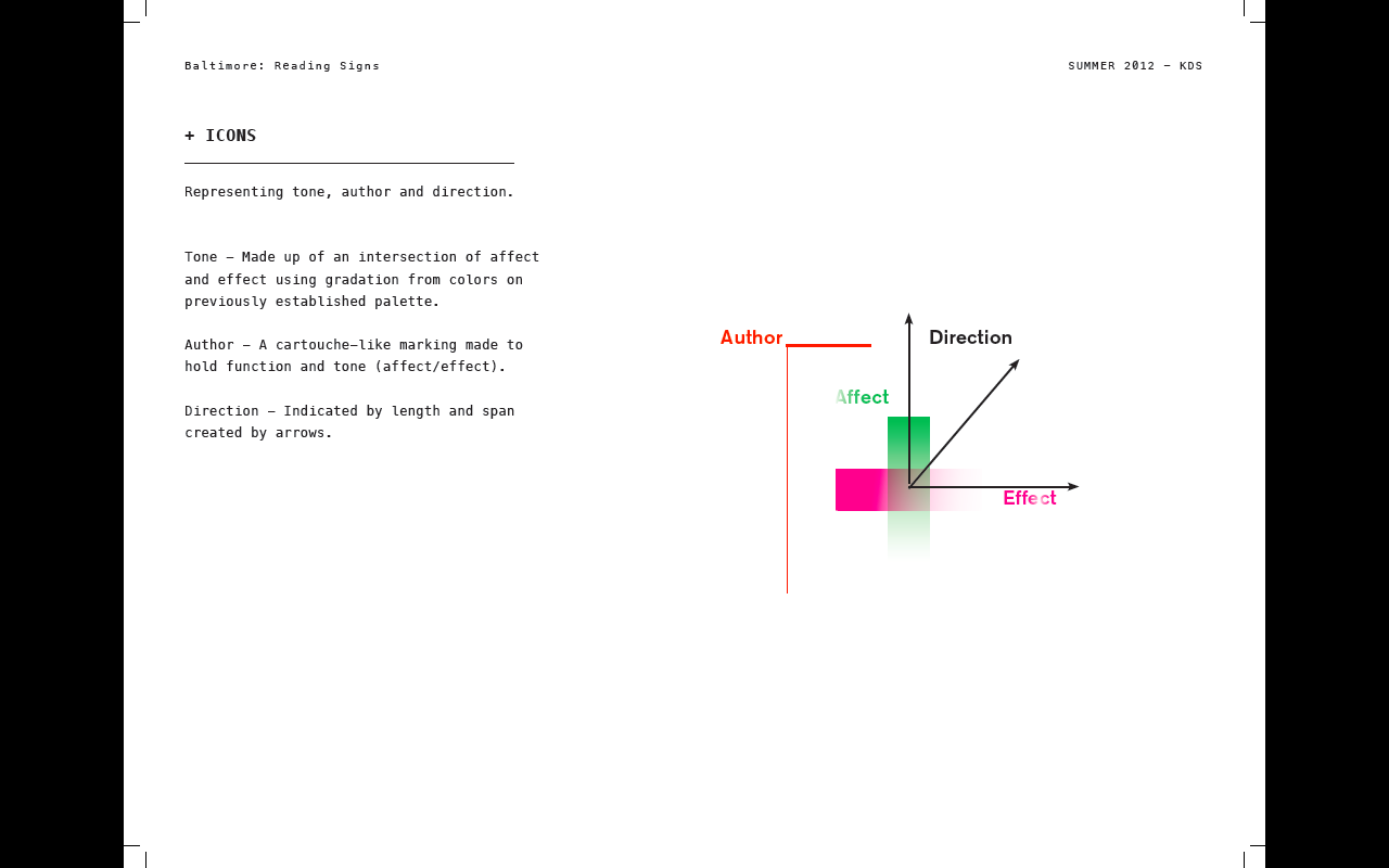
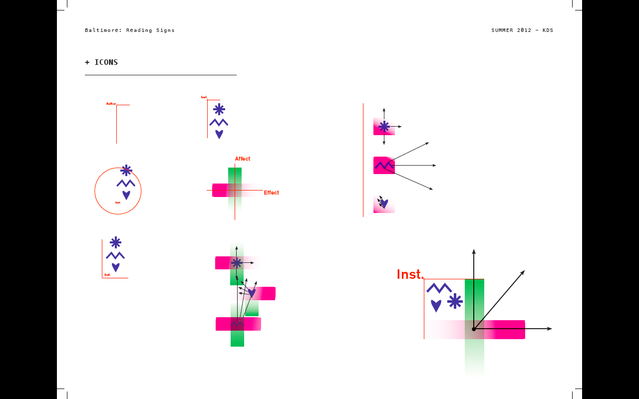
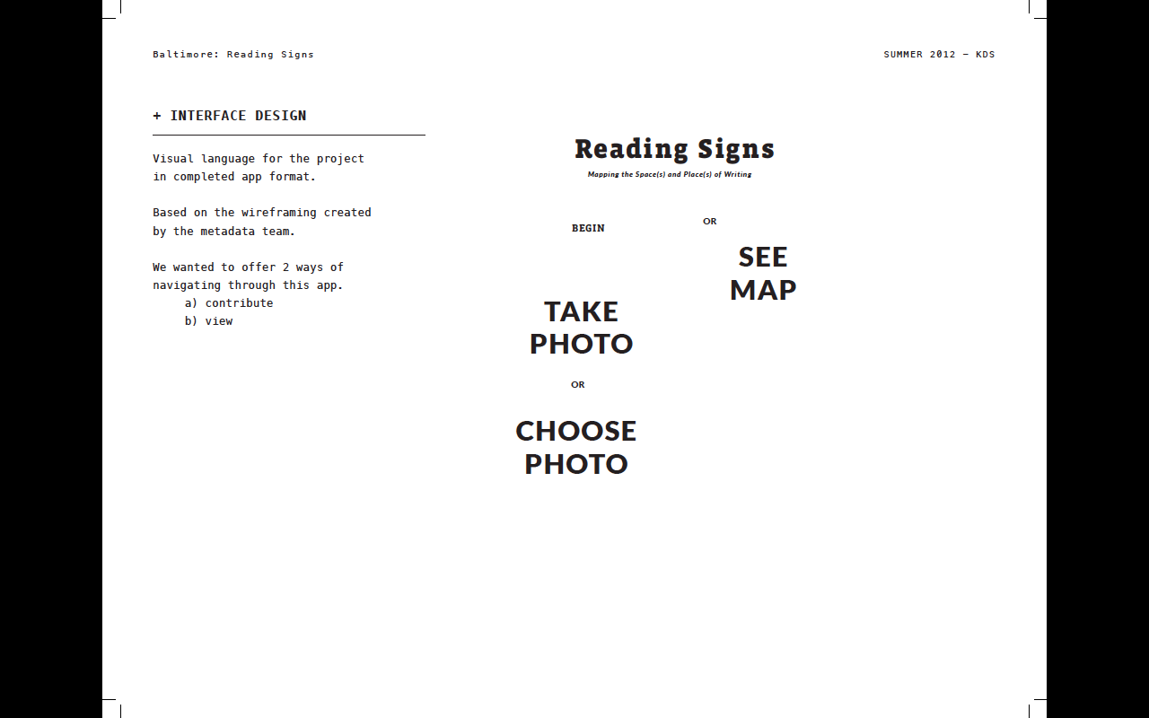
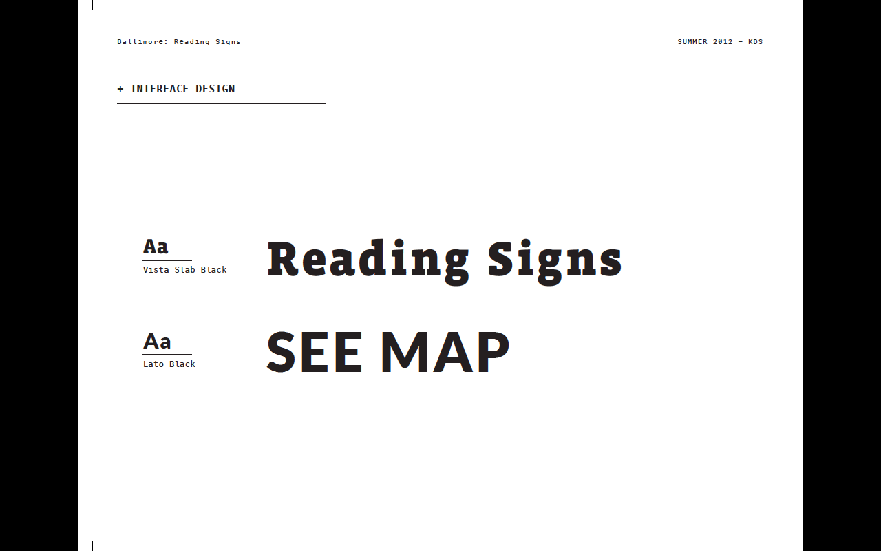
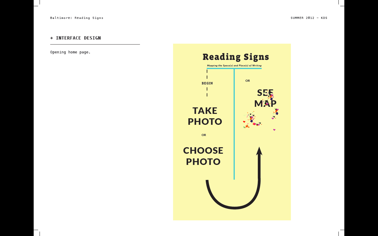
Knowledge Design-2BALTIMORE: READING SIGNS is a site-specific project surrounding affective cartography. We developed an interface for participants to log their experiences capturing images of signs in the city. Design-wise, we wanted to create a narrative from the results, to better understand them; to read more from a map than simply geography or city lines.
UX
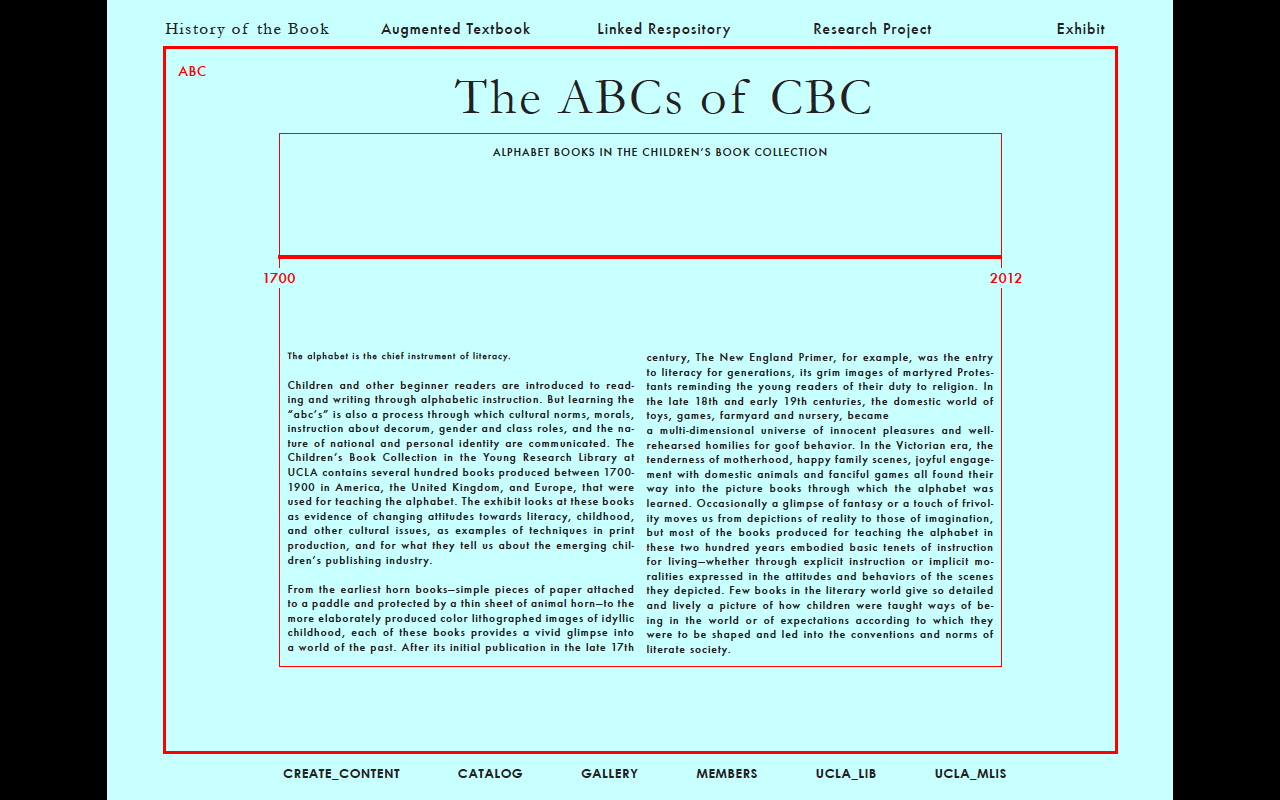
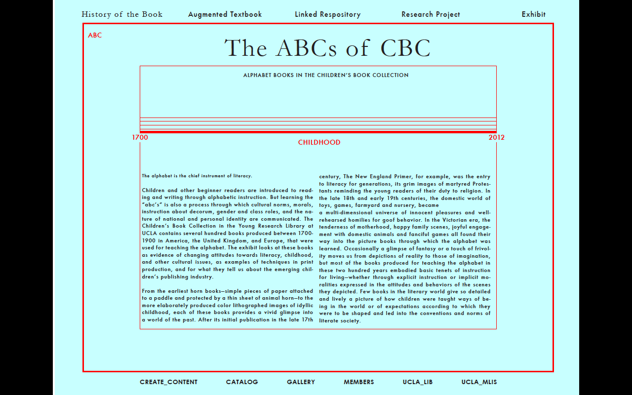
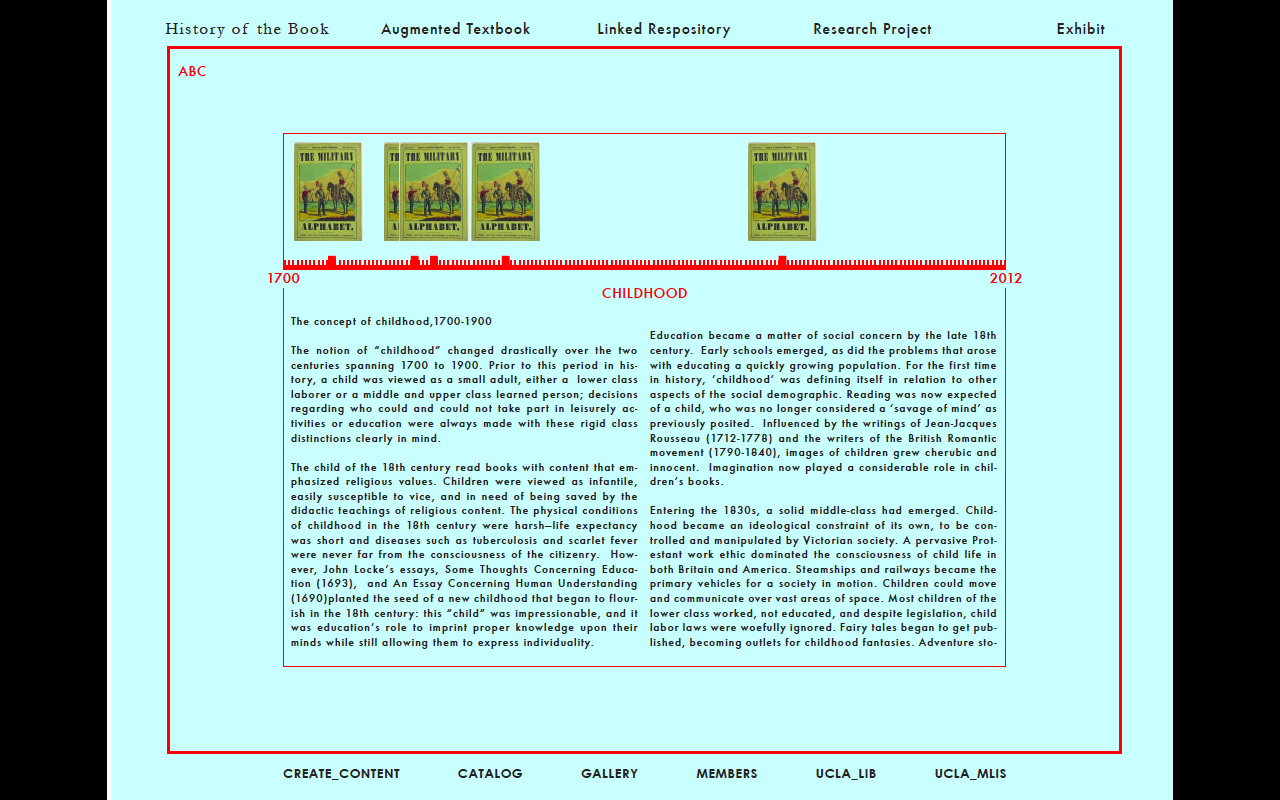
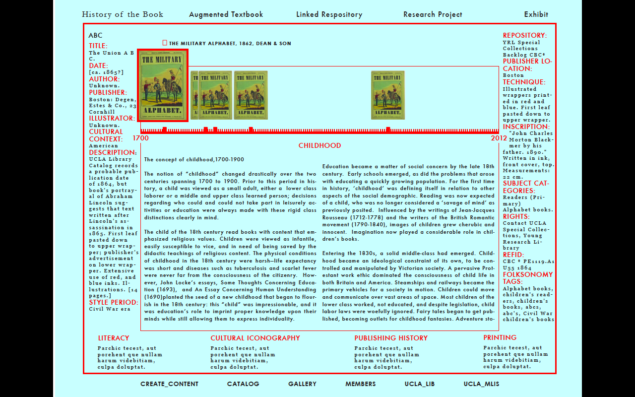
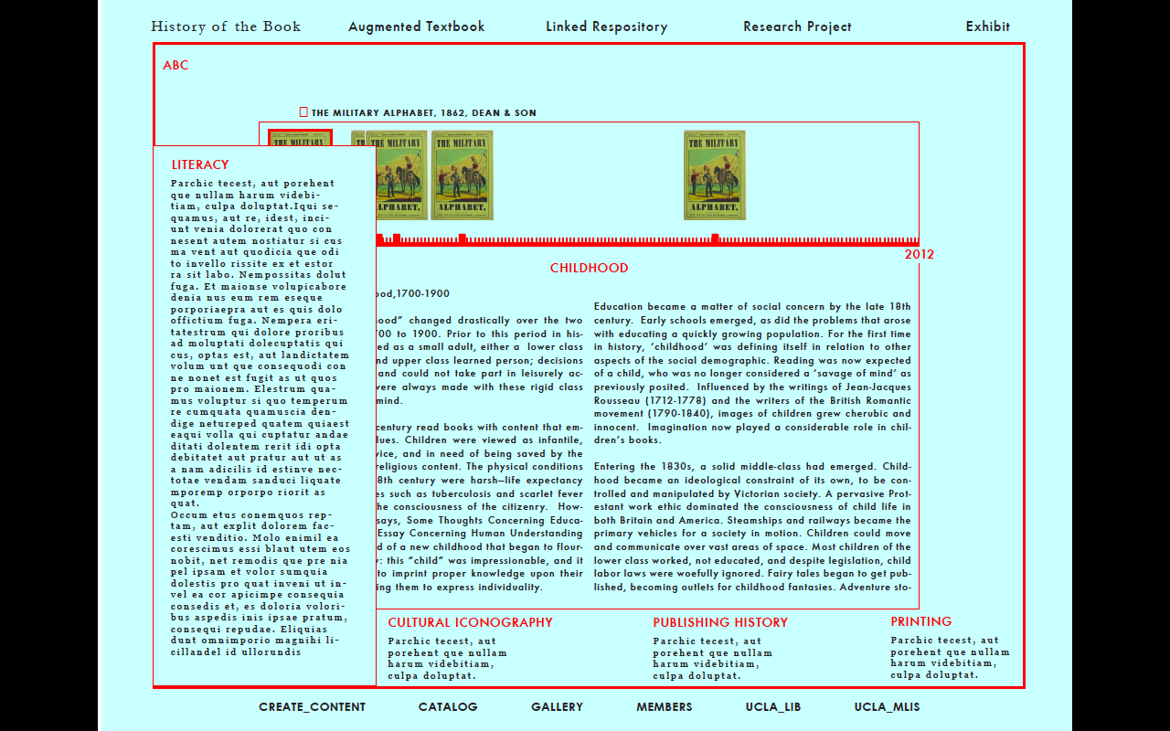
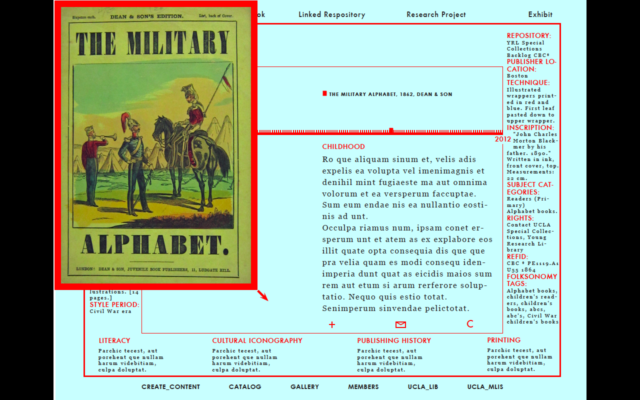
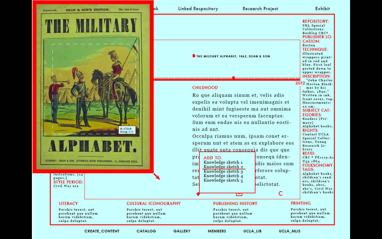
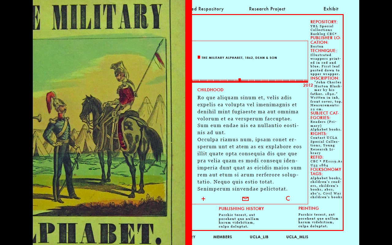
Knowledge Design-1ABC's For CBC's (Children's Book Collection). I designed this interface in keeping with the idea of the Augmented Textbook, mentored by Johanna Drucker, Artist/Professor of Information Studies. I aimed to design a tool for researchers to use and gather information more dynamically, thus increasing efficiency.
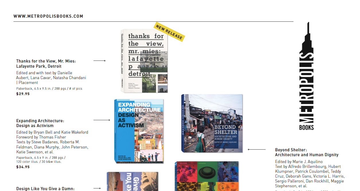
 Metropolis Books
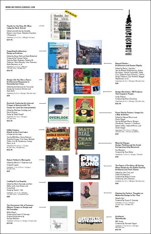
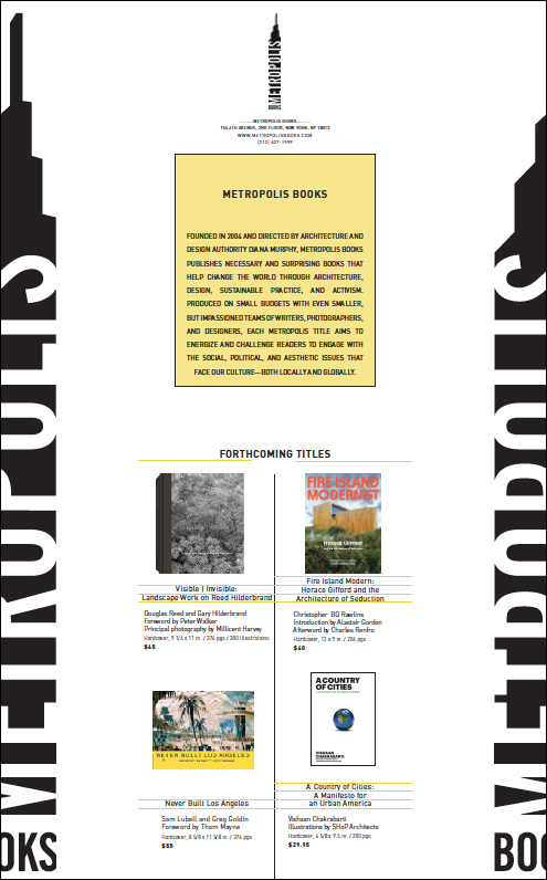
A mailer/hand-out for the imprint Metropolis Books (NY,NY). Produced while interning for Artbook|D.A.P. using the office laser printer. Double-sided printing on tabloid-sized paper; Hand folded. Run of approx. 150 prints.
 (folded-front)
 (opened-interior spread)
 (back-spread)
 (detail i)
 (detail ii)
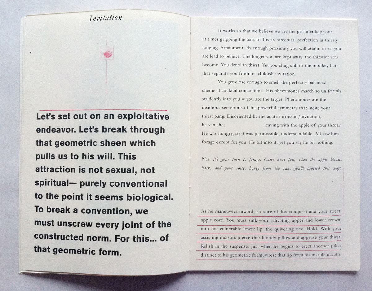
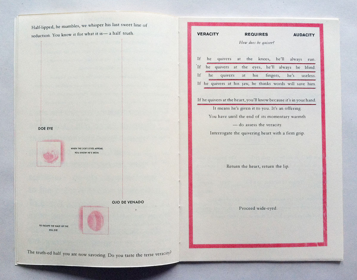
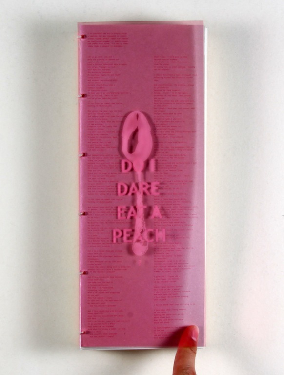
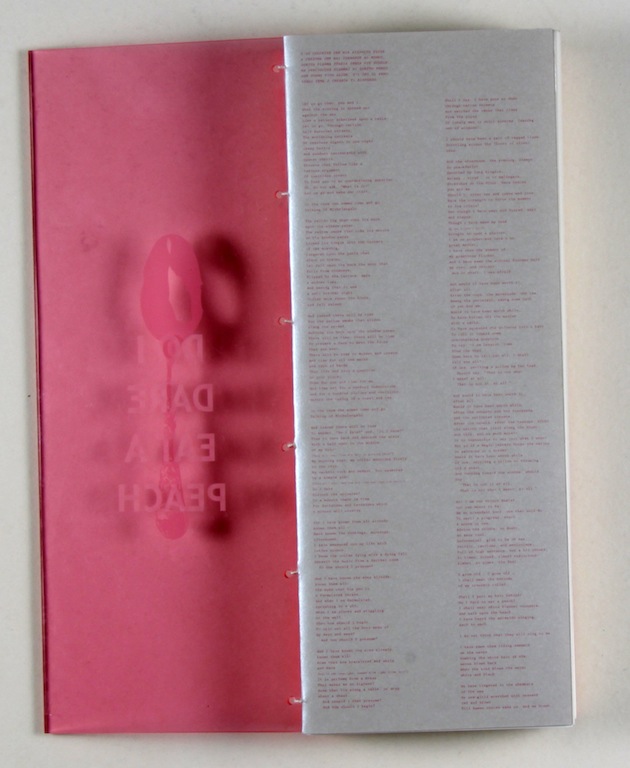
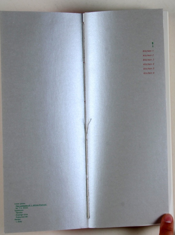
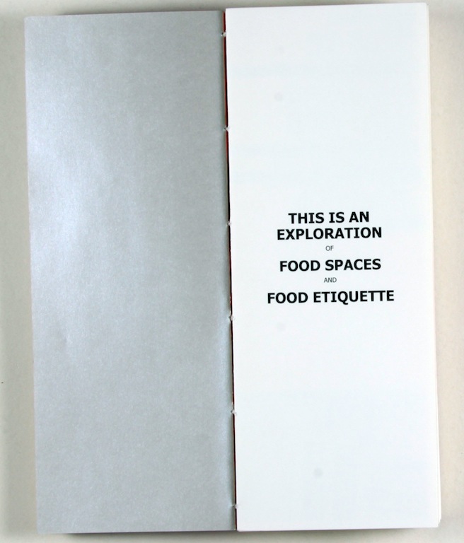
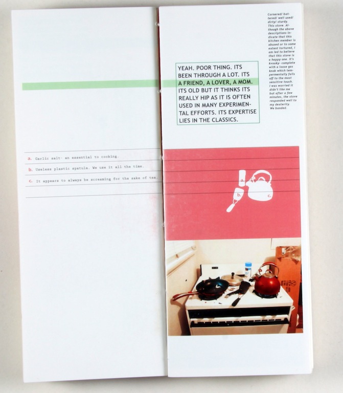
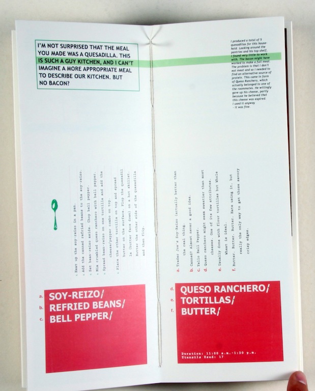
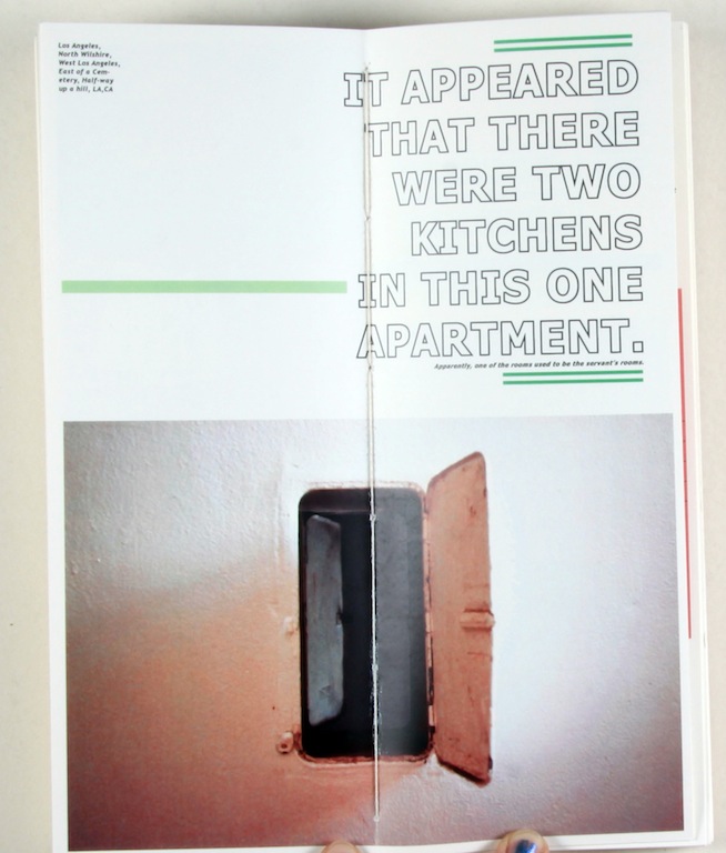
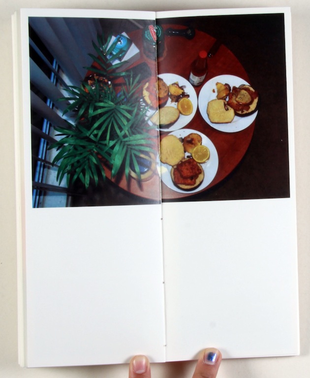
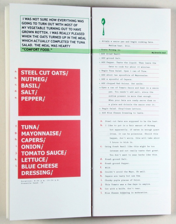
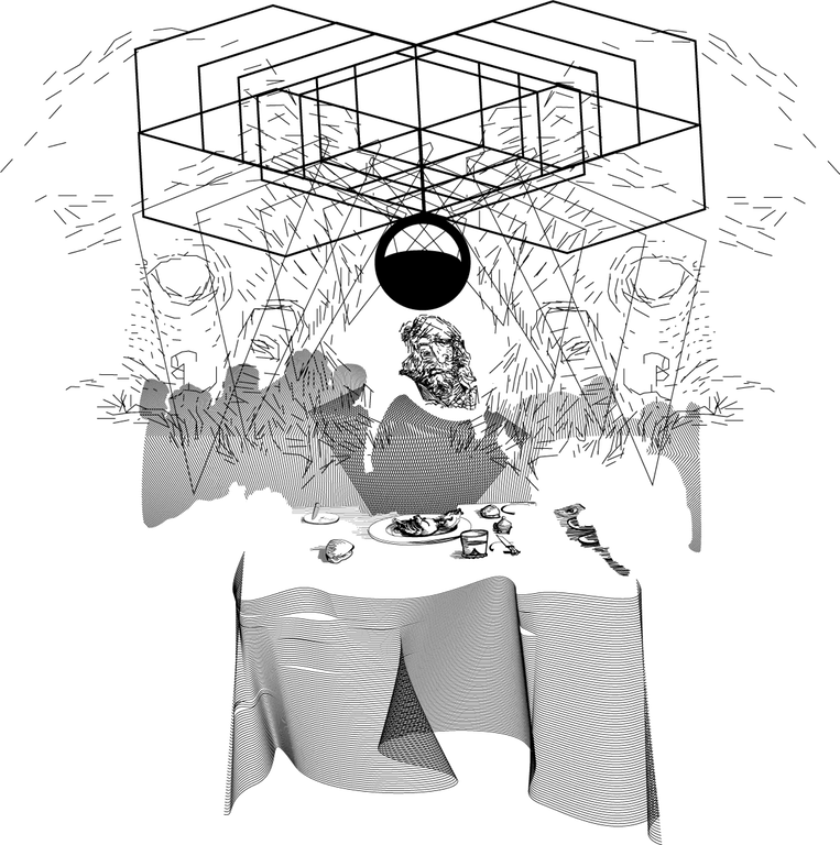
Do I Dare Eat a Peach?
(detail ii)
Do I Dare Eat a Peach?
My final project from Brian Roettinger's Visual Communication course took me into people's kitchens as well as exploring some attitudes towards food and company. I was particularly inspired by T.S. Eliot's poem The Lovesong of J. Alfred Prufrock,in which Eliot makes food references in the context of social interaction. I photographed their kitchens, inquired about their possessions, and produced a meal from found ingredients.
 Graphic works *print/web*
Various design projects created in Illustrator and Indesgin
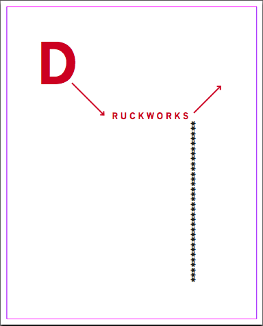
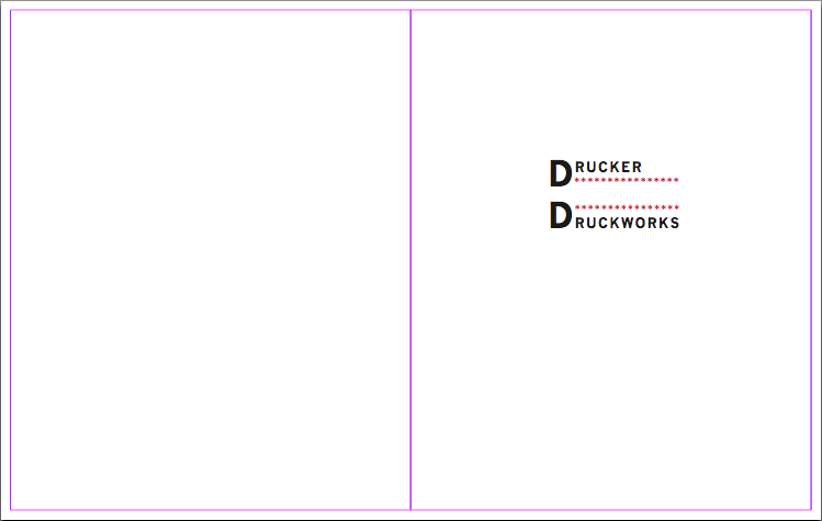
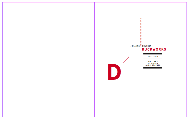
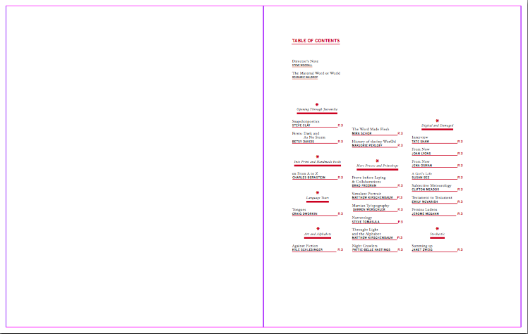
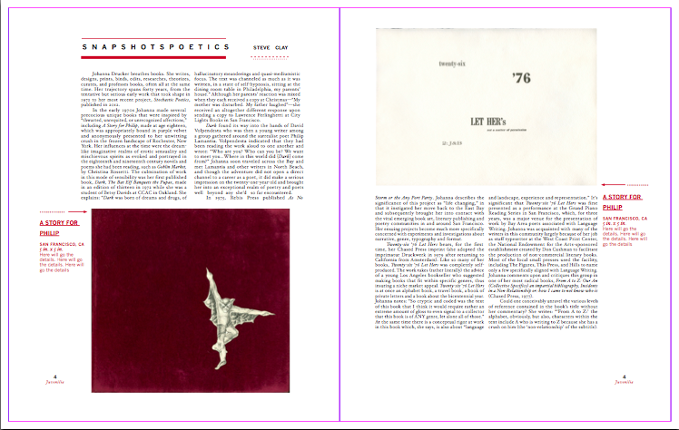
 Druckworks
Druckworks is a catalog for book artist and researcher Johanna Drucker.
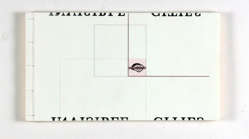
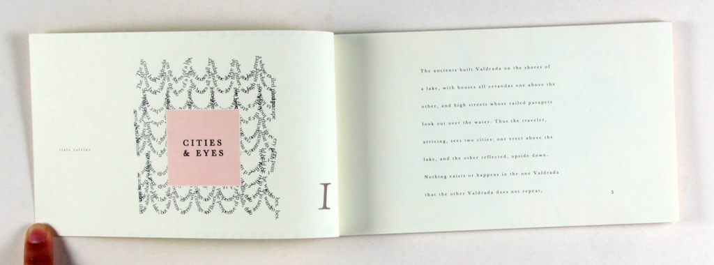
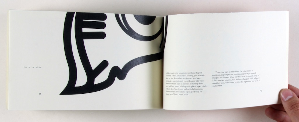
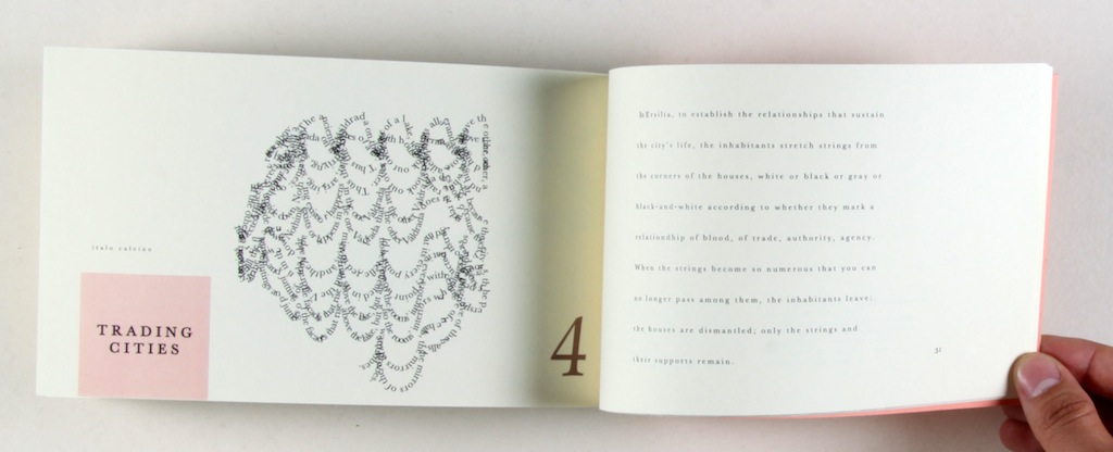
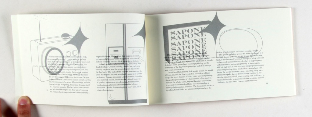
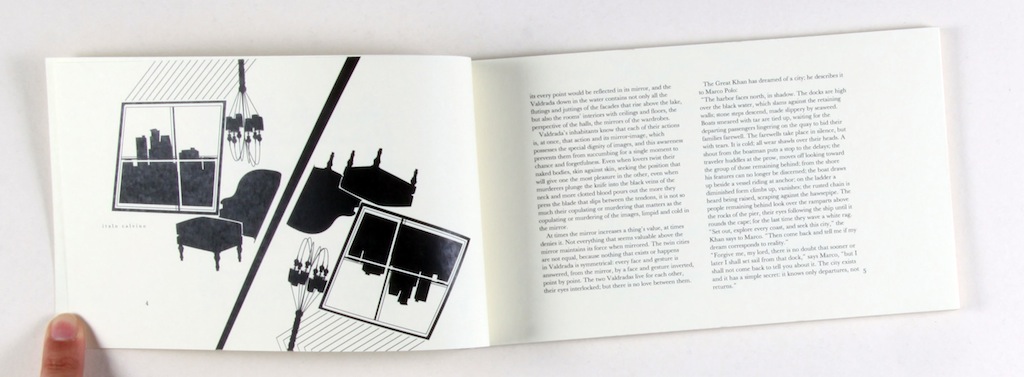
 Invisible Cities
This is a book redesign for Italo Calvino's Invisible Cities. I incorporated illustrations meant to guide the viewer through the concepts of the novel playing on the fluidity of perception and ambiguity of the spaces and scenarios Calvino describes.
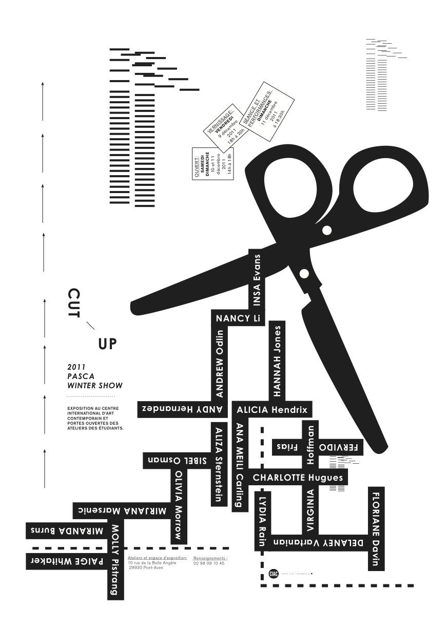
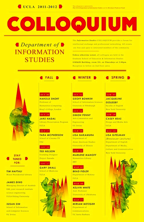
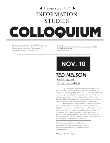
 Colloquium
The Colloquium series poster for 2011 headed by UCLA Information Studies Department under Professor Johanna Drucker. This is the calendar of the events. I went about the design with a little lightness - the idea that it would be less intimidating for undergrads and could spark their interest. Information is explosive, exciting and new- so it is what I aimed to convey.
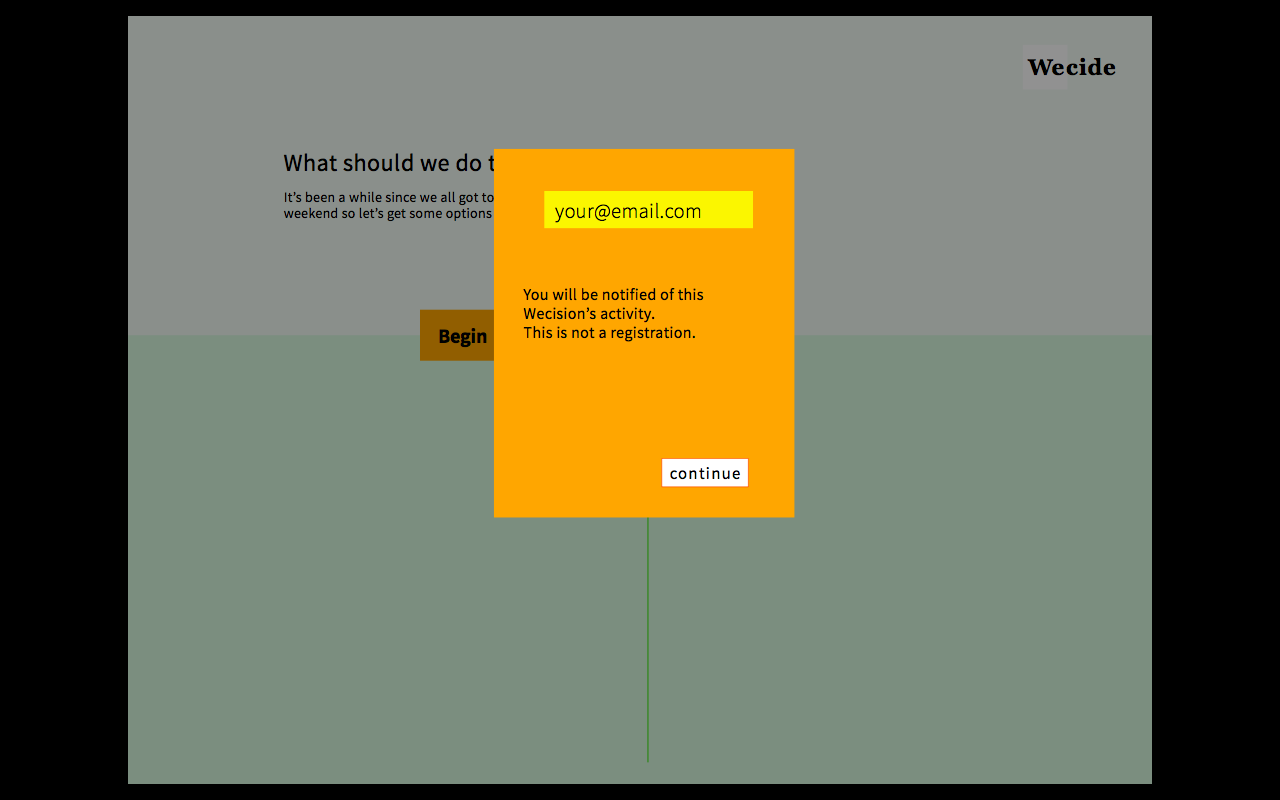
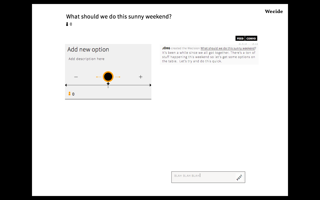
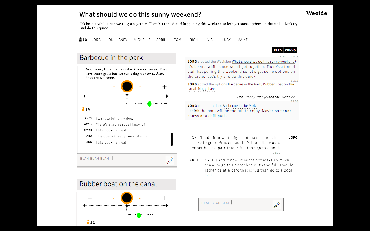
UX *new www.wecide.org
*alpha live*
Over the course of my 6 months at Wecide I worked with the project manager, Jörg Lück, to redevelop this tool for group decision making. Initially, the model was something akin to the Additive Feature Model in psy- chology. Albeit thorough, this model was not conducive for seamless UX. Upon more dissecting, user testing and interviews, I was able to see which features were more accessible. After various iterations and explorations into user flow schemes, the result is a barrier-free tool output- ting a democratic decision.
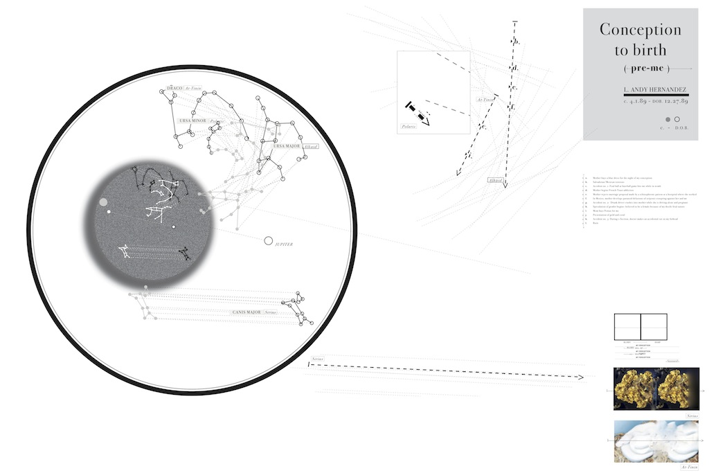
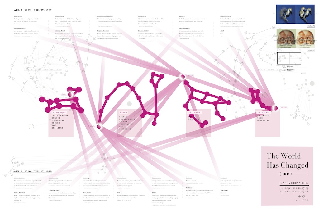
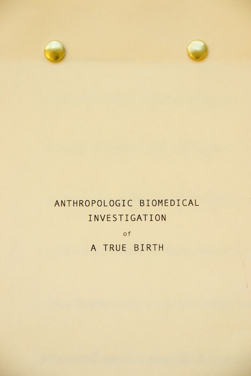
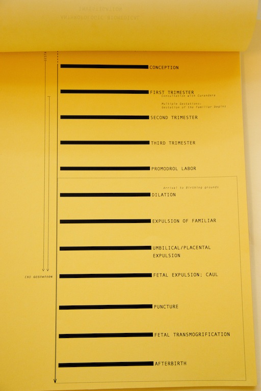
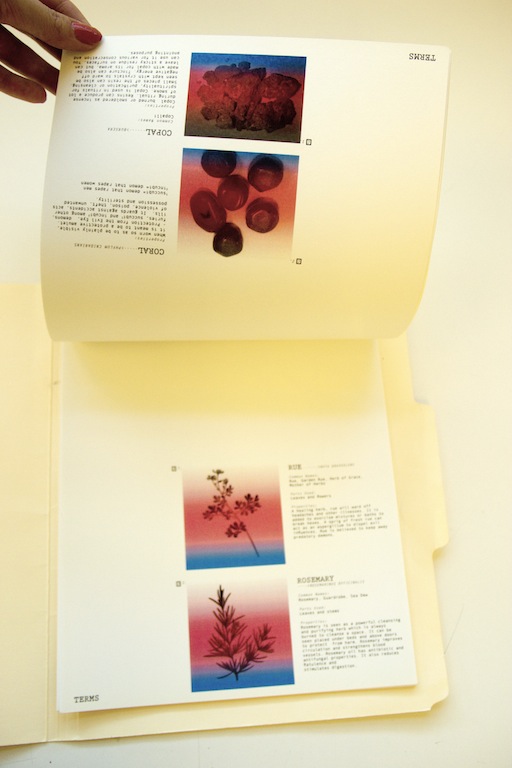
 Notes on a Birth
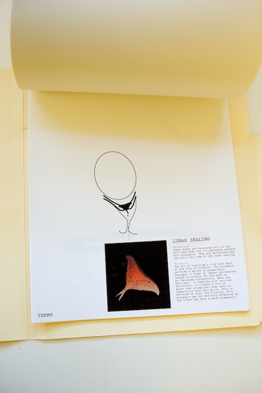
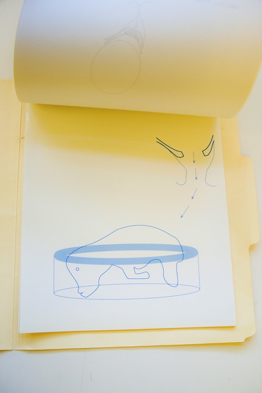
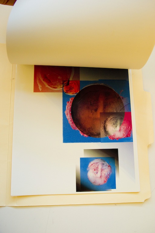
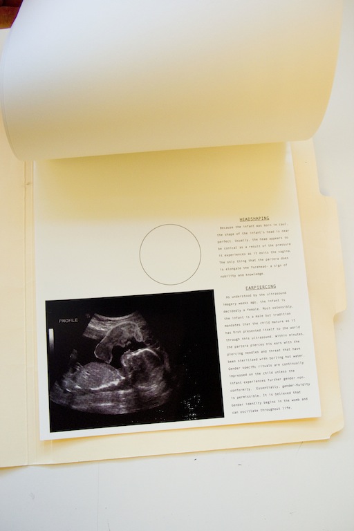
This project is essentially a reinterpretation of the gestational period and birth in the context of contemporary biomedicine with magical realist interjections. The first two images are posters that were created as a part of the process that ultimately became the medium used to illustrate the events that litteraly happened during the real gestation as well as the gestational anniversary of my 21st birthday. The form of this piece comes in the standard medical chart and follows a sort of narrative that documents the magical realist gestation and birth. This includes the birth of a 'familiar' along with the human infant. The fetus is fed through the serpent umbilical cord wich later is responsible for piercing the ambiotic sac outside of the womb. All of these devices inform the imagery and typographic treatment.
-